
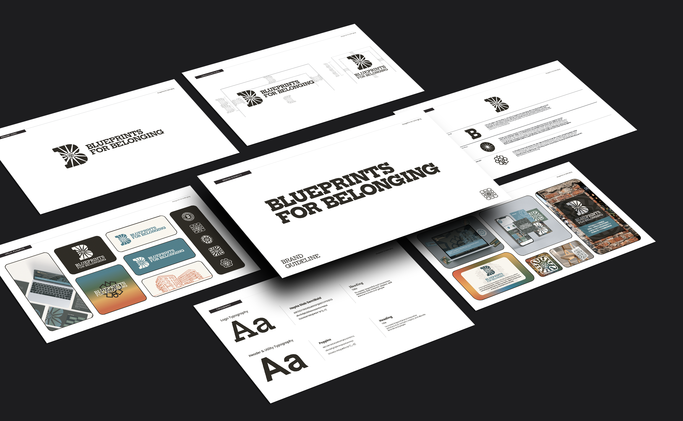
Blueprints for Belonging
Brand Identity & System Design
Turning a complex mission around community, civic infrastructure, and connection into a distinctive brand identity built to work across digital, print, and physical spaces.
Role: Brand Strategist & Designer
Services: Brand Strategy, Logo Design, Visual Identity, Brand Guidelines
Deliverables: Logo Suite, Color Palette, Typography, Graphic Elements, Patterns, Stickers, Application Templates
Project at a Glance:
04
Creative Directions
Explored during concept development
02
Finalist Concepts
Expanded into visual systems
01
Unified identity
Logo suite, visual language, and guidelines
The Challenge:
The word “Belonging” is an abstract idea to communicate visually. Familiar symbols can quickly feel generic, overly institutional, or like a collegiate mascot.
The goal was to create an identity that felt welcoming and credible while reflecting the organization's values around community, shared infrastructure, and collective progress. It also needed to be flexible enough to work across communications, events, partnerships, and community-facing materials.
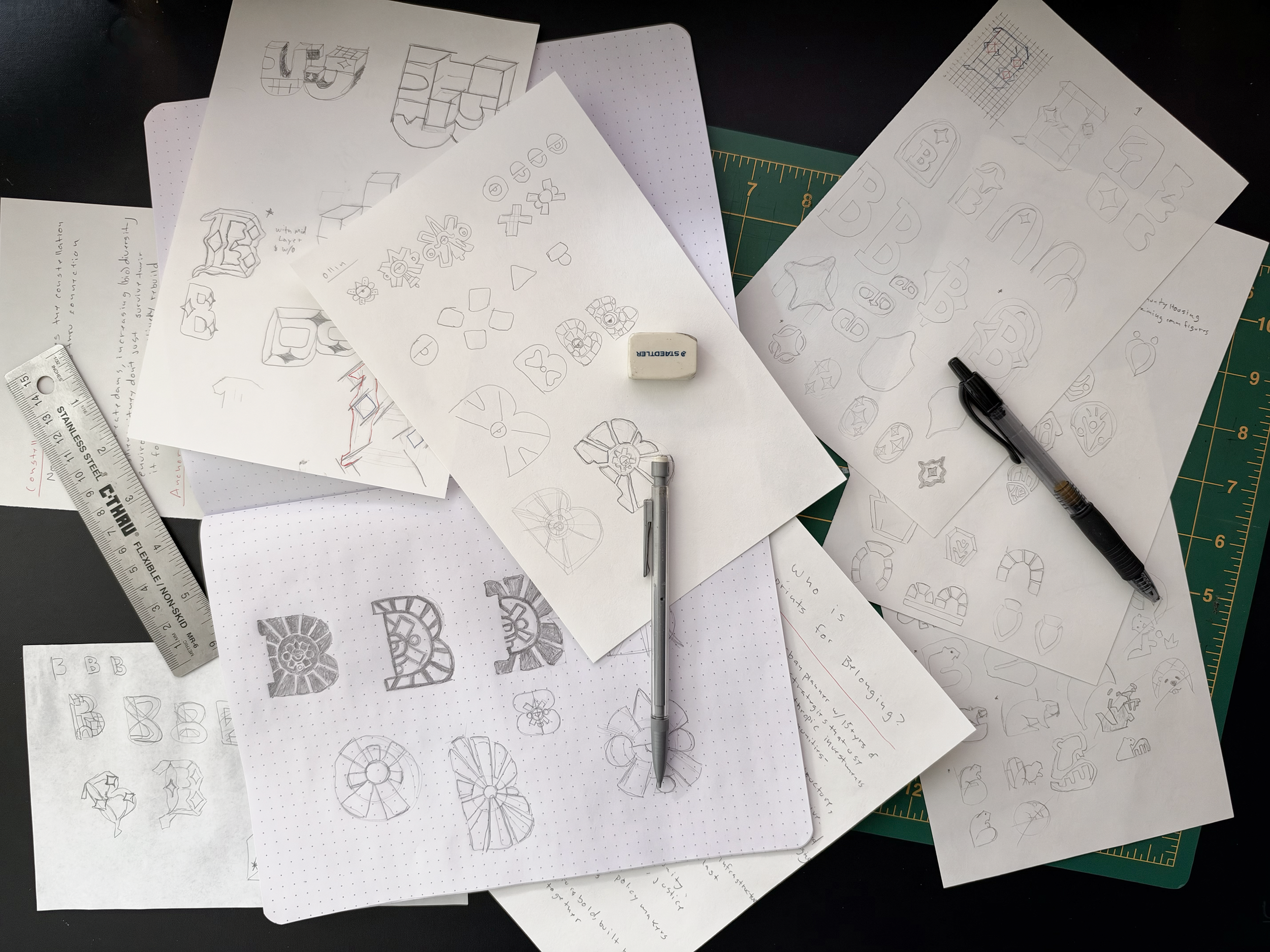
From concept to identity:
The process began with discovery, translating the organization's mission into four visual directions: a beaver, phoenix-inspired symbol, keystone, and constellation. Each explored belonging through building, renewal, structure, or connection. After reviewing the concepts, I developed the two strongest into identity systems, presenting the logo, typography, colors, patterns, and applications together. The final direction combined the letter B’s structure with constellation-inspired imagery and keystone geometry. At the client's request, I added the Ollin symbol, representing movement, as a central element—giving the identity personal meaning while preserving clarity and versatility.
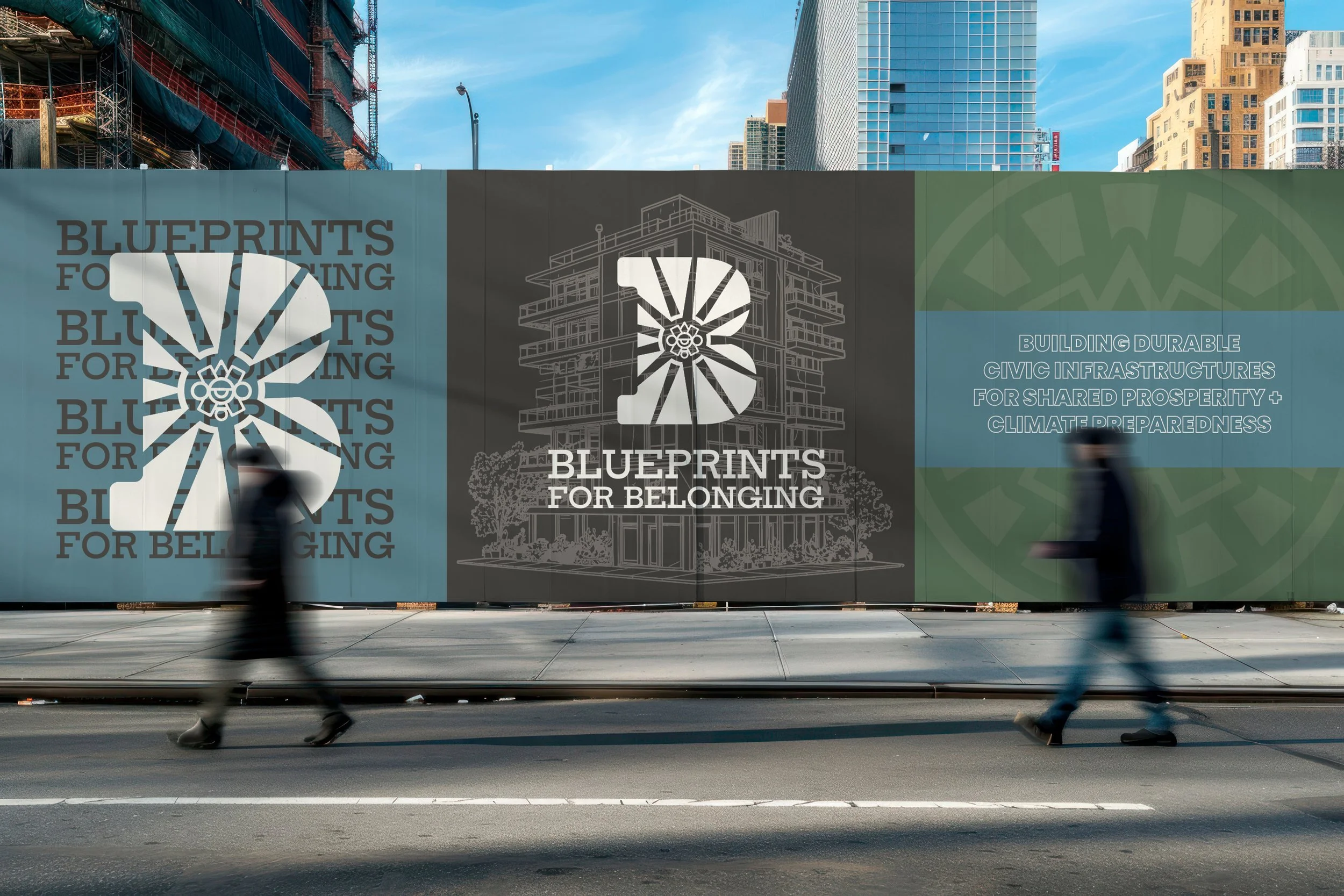
Building the brand system:
With the primary identity established, I developed a supporting visual language to keep the brand consistent across formats and applications.
The system included primary and secondary logos, a coordinated color palette, typography, graphic elements, repeatable patterns, and branded stickers. I also created guidelines that explain the meaning behind the mark, when to use each logo, and common mistakes to avoid.
The brand guidelines turned the identity into a practical toolkit, giving future designers and collaborators a clear reference for applying the brand consistently.
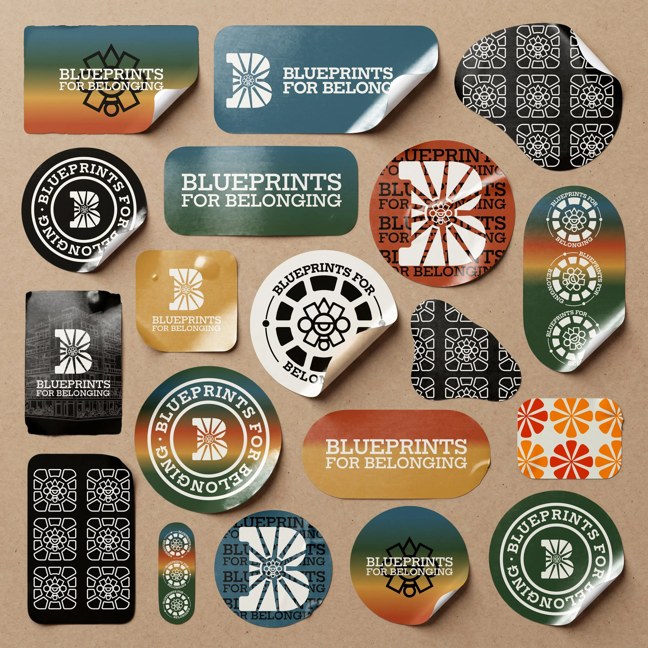
The identity in action:
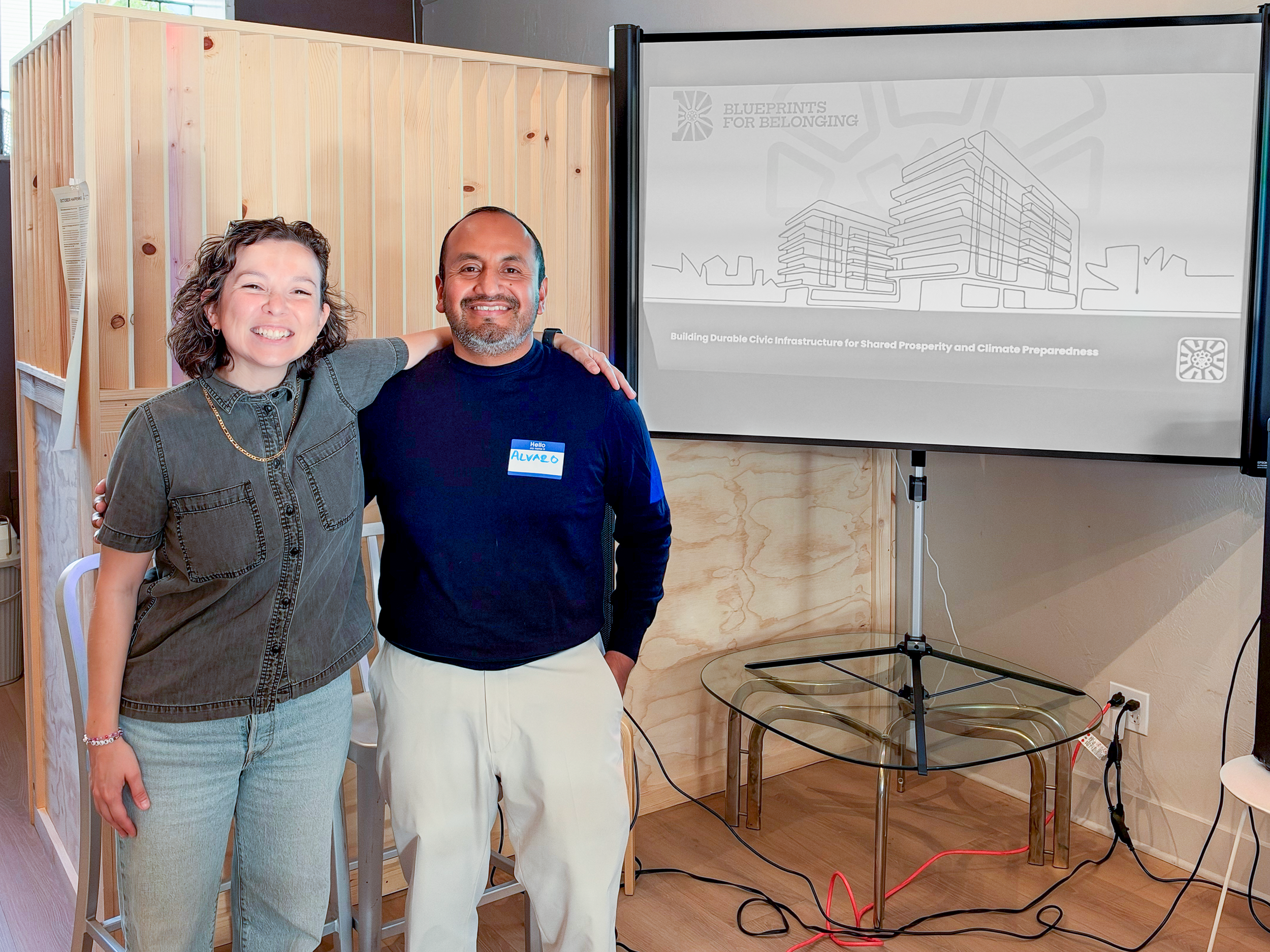
I translated the visual system into application concepts and templates to demonstrate how the identity could extend beyond the logo. Digital layouts, print materials, branded merchandise, and environmental mockups illustrated the relationship between the core identity and its supporting graphics.
The result:
A cohesive brand identity centered on movement, connection, and collective belonging, supported by a flexible visual system and clear guidelines. The project created a foundation for consistent brand expression across digital, print, and community-facing touchpoints.