Youth Uprising
Brand + UI Design
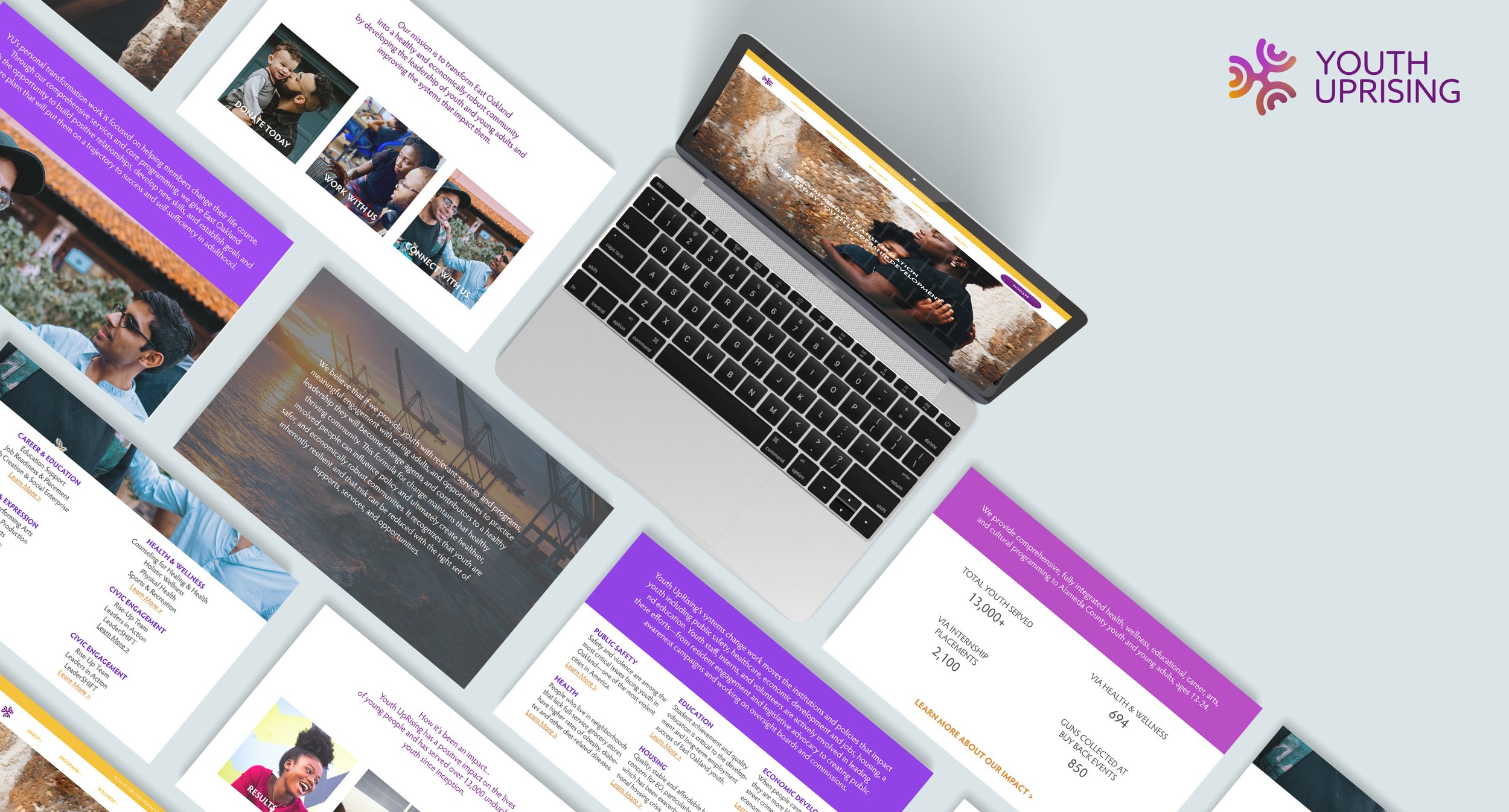
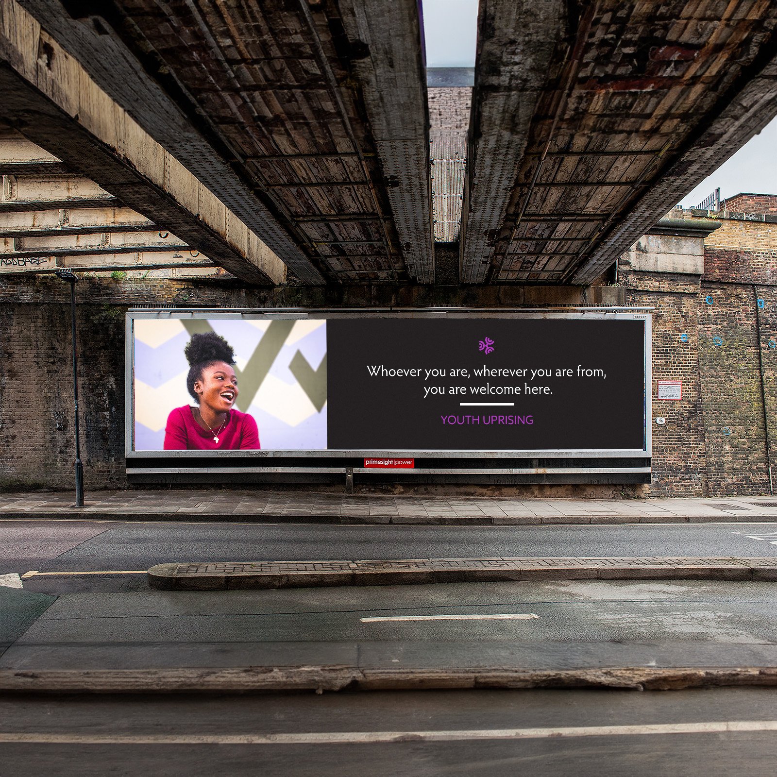
East Oakland Youth Uprising is a community organization dedicated to empowering and supporting the youth of East Oakland. Through various programs and initiatives, they aim to provide opportunities, resources, and mentorship to help young people thrive and overcome challenges.
My Role & Responsibilities:
Service Design | Design Research | Mockup Designs
As the sole designer, I led the research, designs, and execution of the initial concepts of the guide and mockup models.
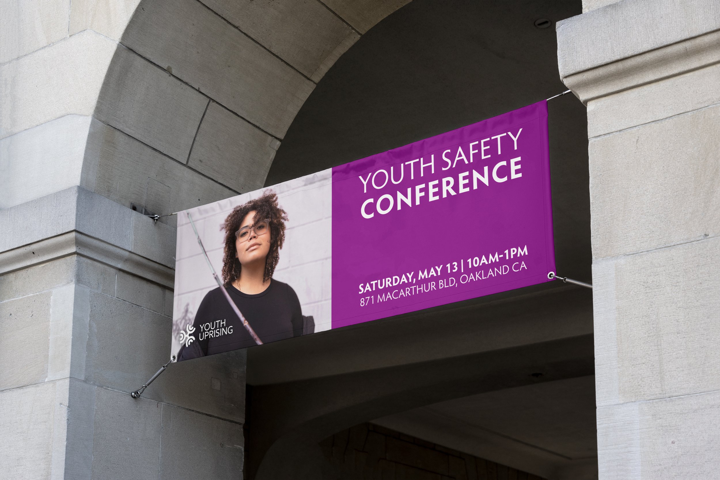
Rebrand and update its image and positioning to stay relevant in a changing world, particularly in industries heavily influenced by trends and consumer preferences. A rebrand will help Youth UpRising reach a broader audience and appeal to different demographics. By using keywords such as Community, Oakland's Oak Tree, the letters Y and U, I recreated the icon for their logo to resemble words that matter and depict the mission of the organization.

Opportunity:
As East Oakland Youth UpRising continues to evolve and expand its programs, it recognizes the importance of aligning its brand identity with the evolving needs and aspirations of the community it serves.
The current branding of East Oakland Youth Uprising, while once impactful, no longer effectively captures the organization's innovative approach, collaborative spirit, and the diverse talents of the youth it empowers.
By embarking on a comprehensive rebranding effort, East Oakland Youth Uprising aims to rejuvenate its image, deepen its connection with the community, and inspire even greater engagement and support for its vital mission of empowering and uplifting the youth of East Oakland.